Staff Experience with Staff Hours Application
A Usability Evaluation of a Cognos 11-Based Time Tracking System
Research & Design with Fangyi Huang
Introduction
The report serves as a guide to improve the development of Staff Hours, a client organization’s internal time tracking system based on IBM Cognos. The Cognos 10 was updated to the Cognos 11 in January of 2019 and the interface of Staff Hours also changed. The Cognos reporting system is a tool being used by project managers to assign project hours to their designees, monitor and manage the staff hours in relation to a specific project. Other staff that doesn't manage project also use Cognos 11 to generate a staffing report for communication by selecting the month range of their interest. The staffing report displays the projects the user have charged to or are planned to for coming months, and the report is often used by users for their time management.
We are interested in learning what they think about the updated Cognos system and what aspect could be improved. Special attention was paid to the efficiency of use because a total of 1,800 employees use it in the organization. As this is an internally-designed tool, if we could optimize the user interface design so what was once a three-minute task is now two minutes or less, then we’ve increased a person's productivity by at least 33% and result in 360 hours annual saving in labor hours. In short, a thoughtful user interface design of a vital internal tool will not only make employees happy but may also increase staff productivity for the company.
To discover valuable insights directly from users themselves, we performed a usability test of Cognos 11 Staff Hours application, supplemented by additional activities. We evaluated the quantitative and qualitative data, and described the differences in experiences between the expert users and a new user. The evidence highlighted existing issues with Cognos 11. We addressed the issues and offered recommendations with design solution to resolve the problems.
For the presentation purpose, we use a fictional name, Staff Hours, as the undisclosed internal application for the client organization. To see the detailed report and the recommendations we offered based on the discovered issues, please see the full report.
Methodology
Participants
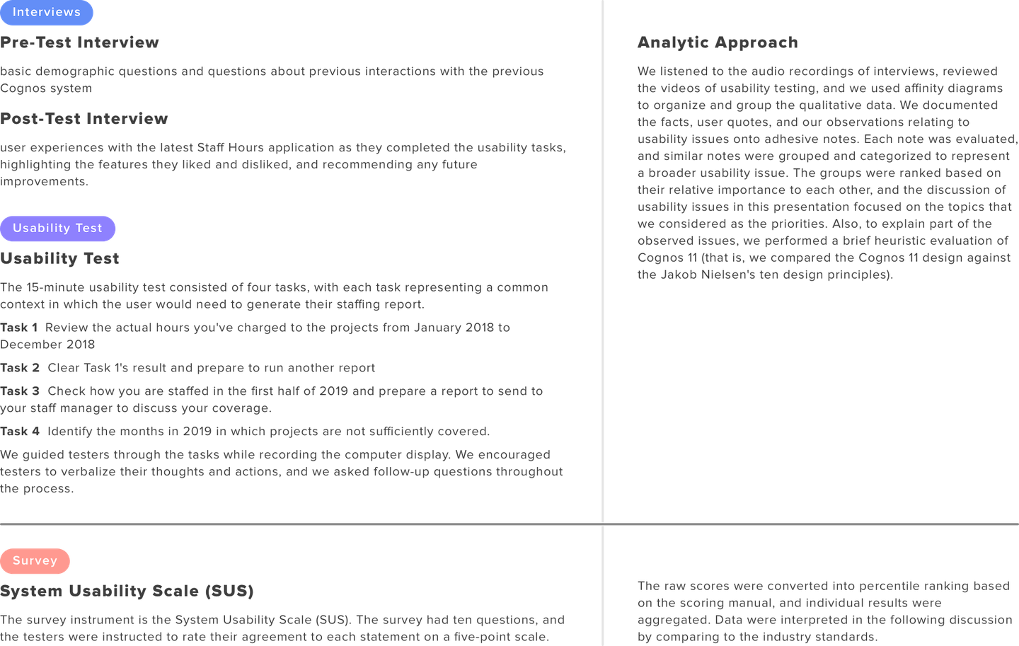
We recruited three participants for the usability study. One of them was not a client organization employee and had no experience with any staffing report system. The other two participants were experienced users (who were employed with client organization and had interacted with Cognos 10). None of them had used Cognos 11 Staff Hours application before the testing.
Procedures & analytic approach
For each session, we invited a tester to a quiet office that was free of distraction. We briefly introduced the study to the tester and asked for permission for audio and video recording of the screen during the test. The testing began with a pre-test interview, followed by three tasks, a post-test interview, and ended with a short usability survey about the day’s experience.
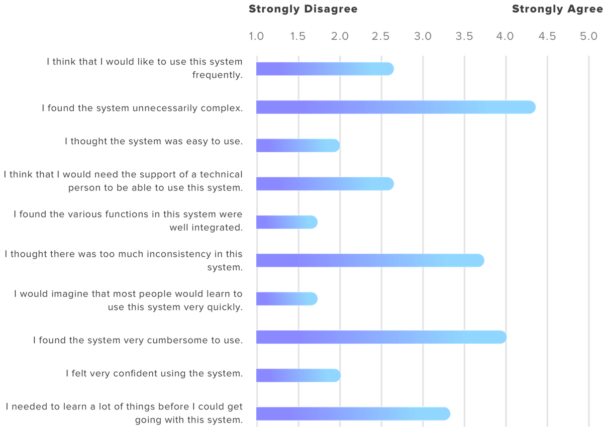
The inclusion of a usability survey provided additional quantitative data on the evaluated system. The use of a mixed method allows us to supplement the limitations of a single research method, triangulate the findings from different data sources, and enables us to identify the consistent pattern in the data and provide verification on our conclusions.
Findings
Overall experience
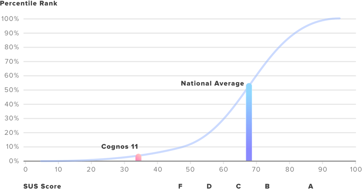
From the pre-test interviews, we learned the expert users had a neutral attitude toward the previous Cognos, and they expected the new version would be more user-friendly. However, in the post-test interview, the expert users stated they were not happy with the changes. As one tester remarked “I thought it is going to be easier [in the new version], but it wasn’t.” The inclusion of the SUS survey allows us to compare the evaluated system against the national benchmark of usability. The average SUS score from 500 studies is a 68. The post-test survey yielded an average score of 33 for Cognos 11, well below the national average and falling into the SUS category of the worst tier. Figure 1 shows how the percentile ranks are associated with SUS scores. The blue line indicates the national usability average of a given tool, and the red line indicates where the Cognos 11 stands compared to the national benchmark.
Finding 1. Information Architecture is unnecessarily complex
The current Cognos constructs its contents and navigation system in a way that is inconsistent with user perception. In our study, Task 2 (clear Task 1's result and prepare to run another report) examines if the user can successfully navigate across pages. Task 2 captured the usability challenges regarding Cognos 11’s IA design. After running the first report, users had extreme difficulty navigating back to the home page (the report inquiry page). Overall, the completion rate of Task 2 was 67% (two out of three) and the average time spent on the task was two minutes and 11 seconds (during which 14 errors were made, on average).
Upon accidentally discovering that he could clear the report by going to the “team content” folder, the new user expressed frustration with such folder organization and commented that the information structure made no sense to him.
A heuristic evaluation of the current interface suggests a severe violation of the visibility of system status. The site did not provide any visible navigational aids—such as site map, place markers to indicate where the user is in the system. The lack of navigational aids created a significant barrier when users navigate between pages.
Finding 2. The staffing report does not address user needs directly.
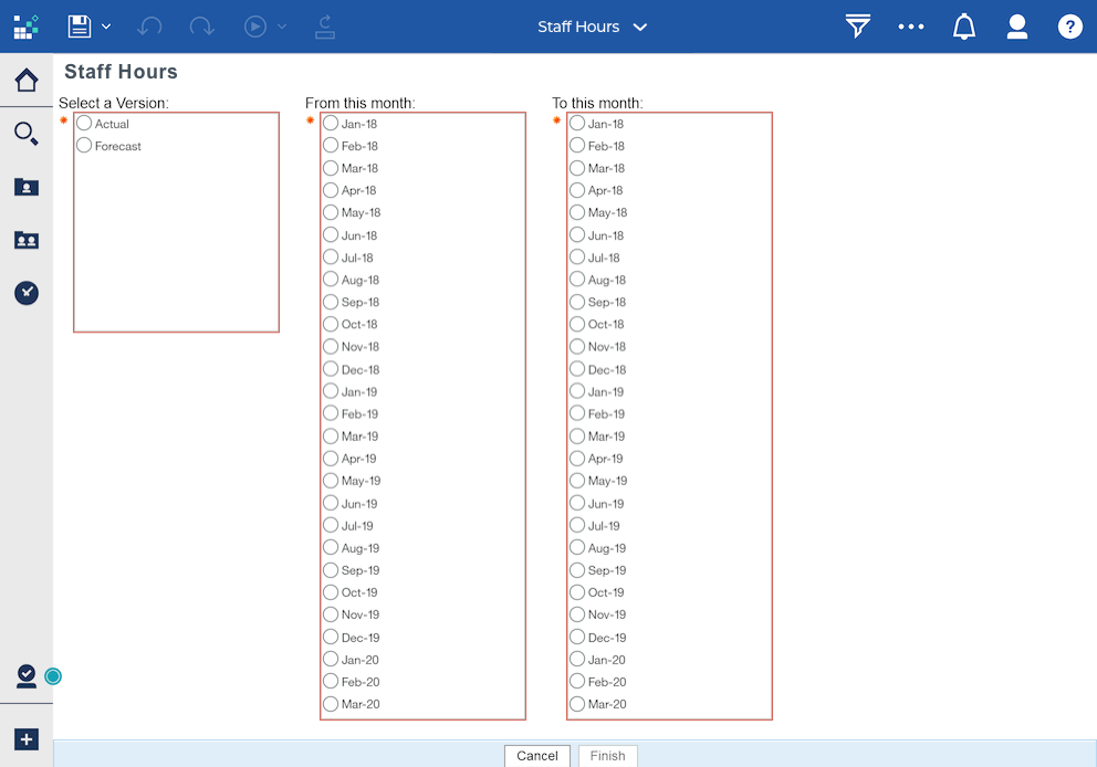
The goal is to use the system is primarily to monitor users’ staffing coverage. To do so, users would either pick “Actual” or “Forecast,” depending on whether they want to see their charged hours in the past or budgeted hours for coming months. They need to specify the date range on “Staff Hours” page (as seen in Figure 2) and submit the request to get a report.
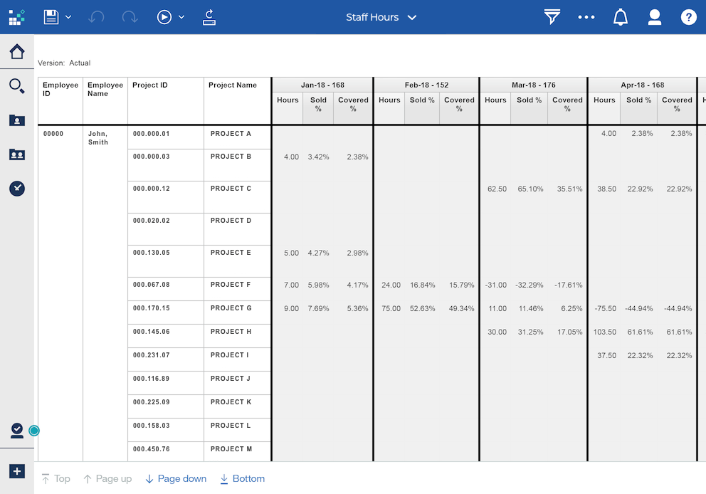
While the experienced users remarked that they have gotten used to this report format (seen in Figure 3) and did not have a problem understanding the report, some improvements could be made to improve the efficient use of the report. For instance, present additional statistics about users’ coverage gaps, help users to plan for future work against budgeted hours, allow for easy report sharing, and provide tools to keep users informed of their staffing status. Please see the full report for the details of user needs as we learned from the interviews.
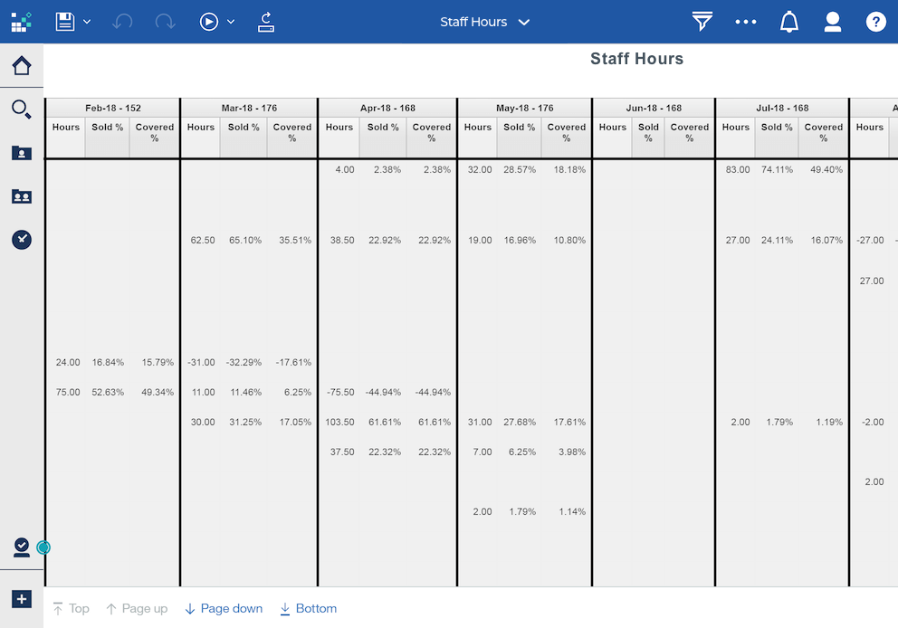
Also, we compared the report interface against Jakob Nielsen's ten general design principles, and one usability issue stood out, a severe violation of Nielsen’s sixth principle (recognition rather than recall). The report is generated in a table format where each row represents a project, and each column represents a month. An issue would occur if the report includes many projects (many rows) over several months (many columns), that is the table becomes very large to view and reading requires scrolling. The row and column headings are not frozen, so when users scroll down or scroll to the right, they have a hard time knowing which project or month the value is referring to (see Figure 4). A good report interface design minimizes the user’s memory load by making the referring months and projects visible so that the user does not need to scroll back and forth to figure out what the values refer to.
Finding 3. Several design choices prevent efficient use of the system
Issue 1: Non-standard visual representation confused users
Some errors made during the usability tests were due to participants’ misinterpretation of icons and buttons. The case is especially true for the new user as he spent time exploring the interface, trying to make sense of the visible buttons and menu before working on the task. The new user hovered over the icons, paused, and thought if those were relevant to the task. If the system had used more standard visual representations, the new user could have glanced over, knowing they are not relevant and then move on to the task.
The non-standard icons created additional obstacles when users had to find solutions from the system. In the scenario of Task 3 (create a staffing report and share with the manager), none of the testers were able to share the report on their first attempt. All users’ first reaction was to click on the “Save” button located in the top left area of the window after the report was generated, but the system pops up an error message when the button is hit. Users had to find another way to save and send the report.
As some of the icons used on the site are not commonly seen elsewhere in other applications, and users reported feeling uncertain about the icons, they spent more time reading the label text and yet interpreted the same icons differently. Moreover, the familiar icons used on the site do not convey the information users typically associate with them, missing the point of using the icon in the first place.
Issue 2: System response time is too long
Table 1 shows the average system response time of each task.
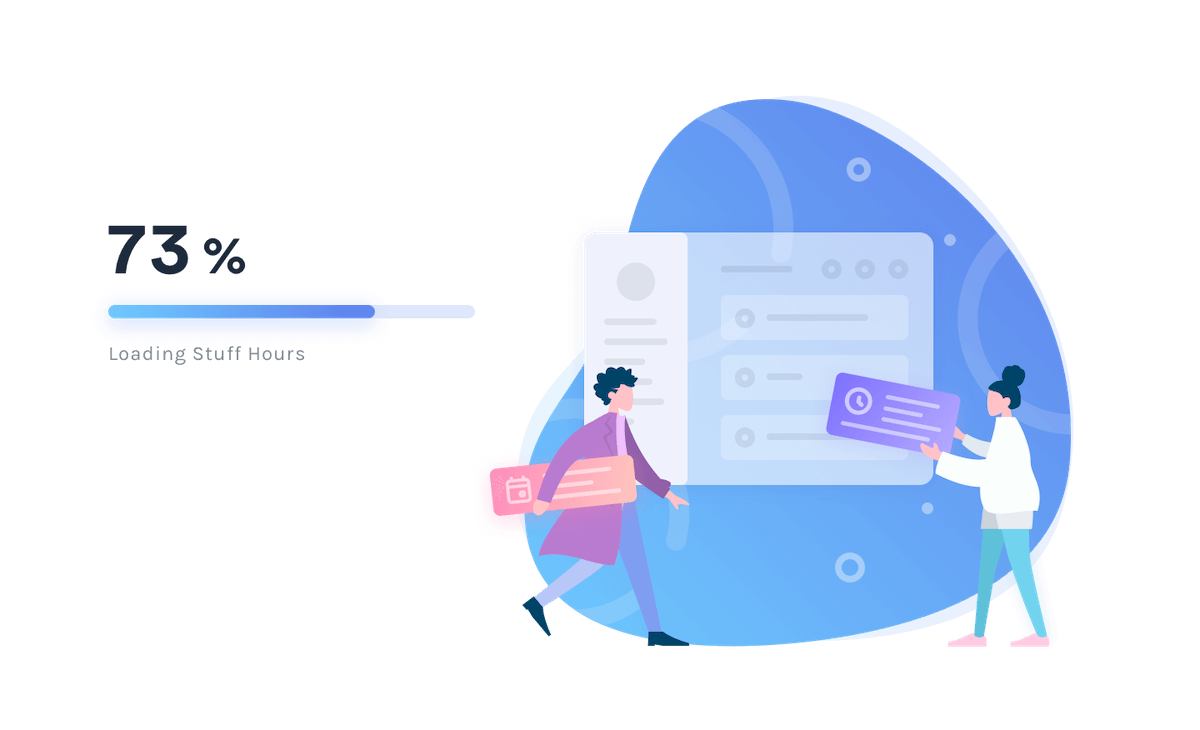
The system took longer than expected to produce a result as users may normally expect from a simple task like this. Also, the current wait message (a mostly empty pop-up window with a spinning circle in the middle and a cancel button under the spinning icon; see Figure 6) does not deliver enough information about the report status to users. Users were unclear how long they needed to wait and, when they were waiting longer than expected, they were not sure if the system was still running or simply not responding.
Issue 3: Many visible irrelevant options on the page
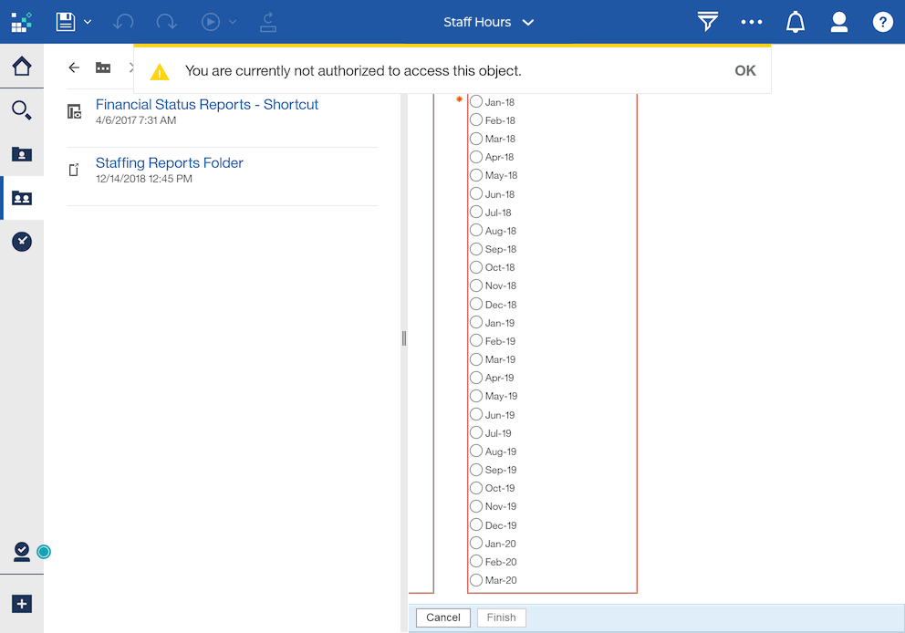
There are many action buttons on the page that users are not authorized to use, yet they are made visible and clickable. When users must explore the application and experiment with the available options, as a user commented, they would expect everything they see on the site is relevant to them. One example is that testers were confused to see an error message read that “You are currently not authorized to access this object” (see Figure 7) when they clicked on some buttons as they explored the system.
On the other hand, critical actions are not obvious. A user explained that when she first used the site, she did not know what to do after the month selection because the critical action button, “Finish,” is small and located at the very bottom of the page—out of visual range (and possibly requiring scrolling).
Issue 4: The month-picking is a “pain.”
There are two select menus ask the user to specify the beginning and ending months of the staffing report. Users need to select the months of interest from a list of every single month from January 2018 to December 2022 (seen in Figure 9). It is difficult for users to read the options due to small text font and lack of contrast. Small text font and lack of visual cues lead to poor readability. It is especially true for new users not familiar with this format, as the new user who first saw the select menus and complained immediately saying that “It is crazy to look at the options that look almost the same [audible sigh]... it is hard to target what I want.”
The current date picker format is not commonly used and is easy to cause user error. The current month picking menu is problematic in several ways. A user shared in the pre-test interview that she once helped a colleague to troubleshoot an issue of receiving an empty staffing report. The problem turned out to be a result of user error, as they picked an earlier month in the “To” field than the selected month in the “From” field.
Conclusion
Cognos is an important internal tool for client organization staff to plan and monitor their staffing hours. A thoughtful user interface design of such an important tool not only provides a satisfying user experience to staff but also can reduce training and support cost and increase staff productivity. The evaluation of the upgraded Cognos 11 suggests several areas for interface design improvements. Some outstanding issues include the system’s overly complicated IA, unfriendly report layout, and other usability barriers preventing efficient use of the system. The recommendations embedded in this report are designed to address the issues discovered. We hope that this report not only serves as a UI guide for the next Cognos Staff Hours application development but also could start a dialogue for the company leadership to become aware of the staff’s experience with internal tools.
Design Proposal
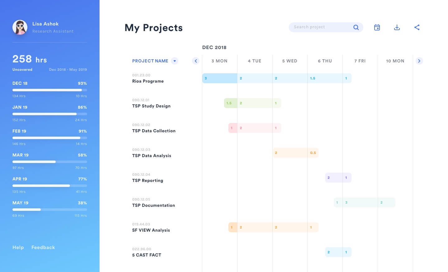
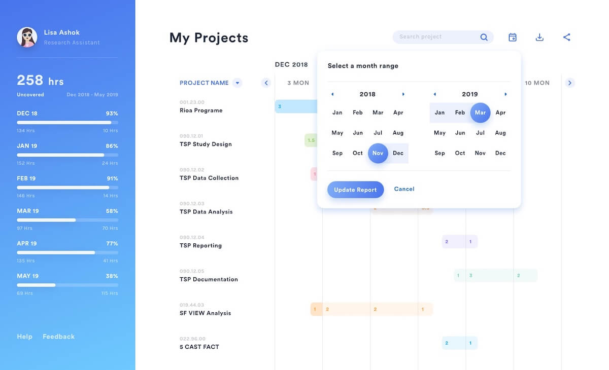
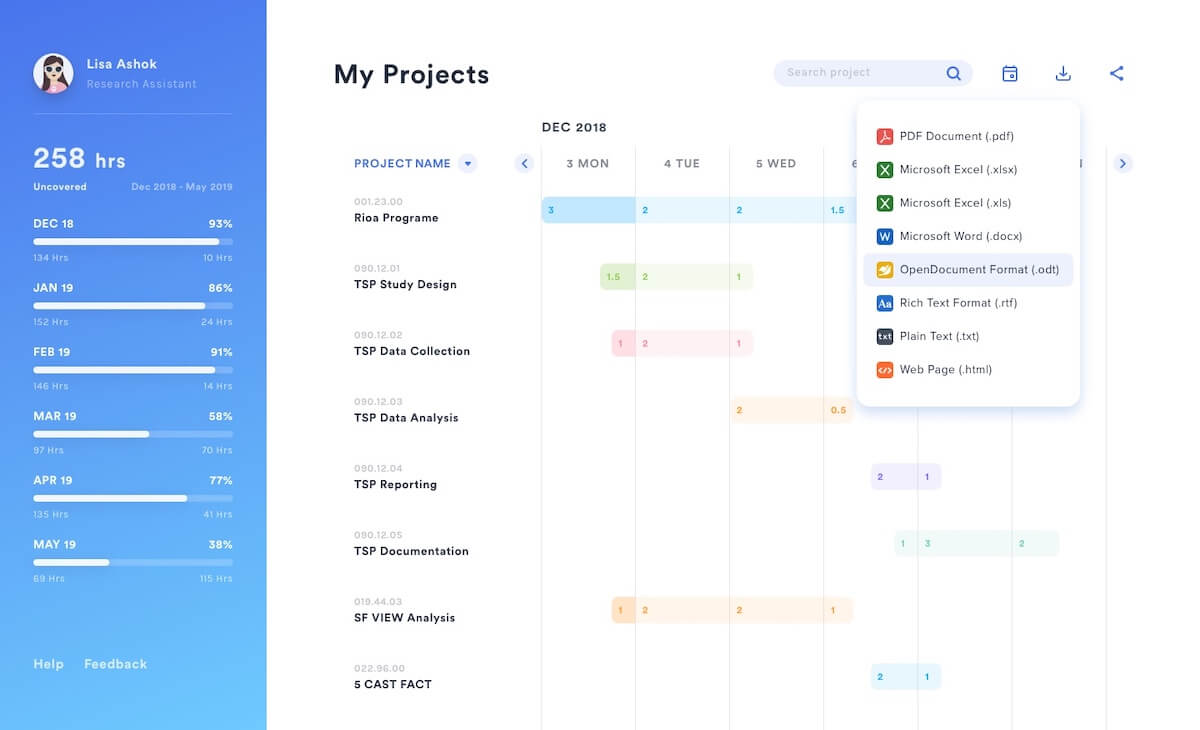
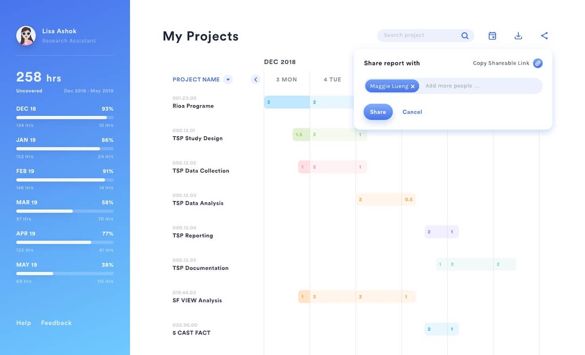
Taking a project time reporting system from its ambiguous information structure, non-conventional icons and terminology, lengthy report generating time, and various technical failures were part of the challenge here. All users at the organization in question utilized the system for their project reports, but also manual assignment of project hours, so the system had to address all of these issues and more. Instead of trying to solve the issues one by one, the focus of the application was shifted from report generation to project management, and making the reporting a secondary feature. Once the users figure out their project hours distribution, reporting is just a click away.


