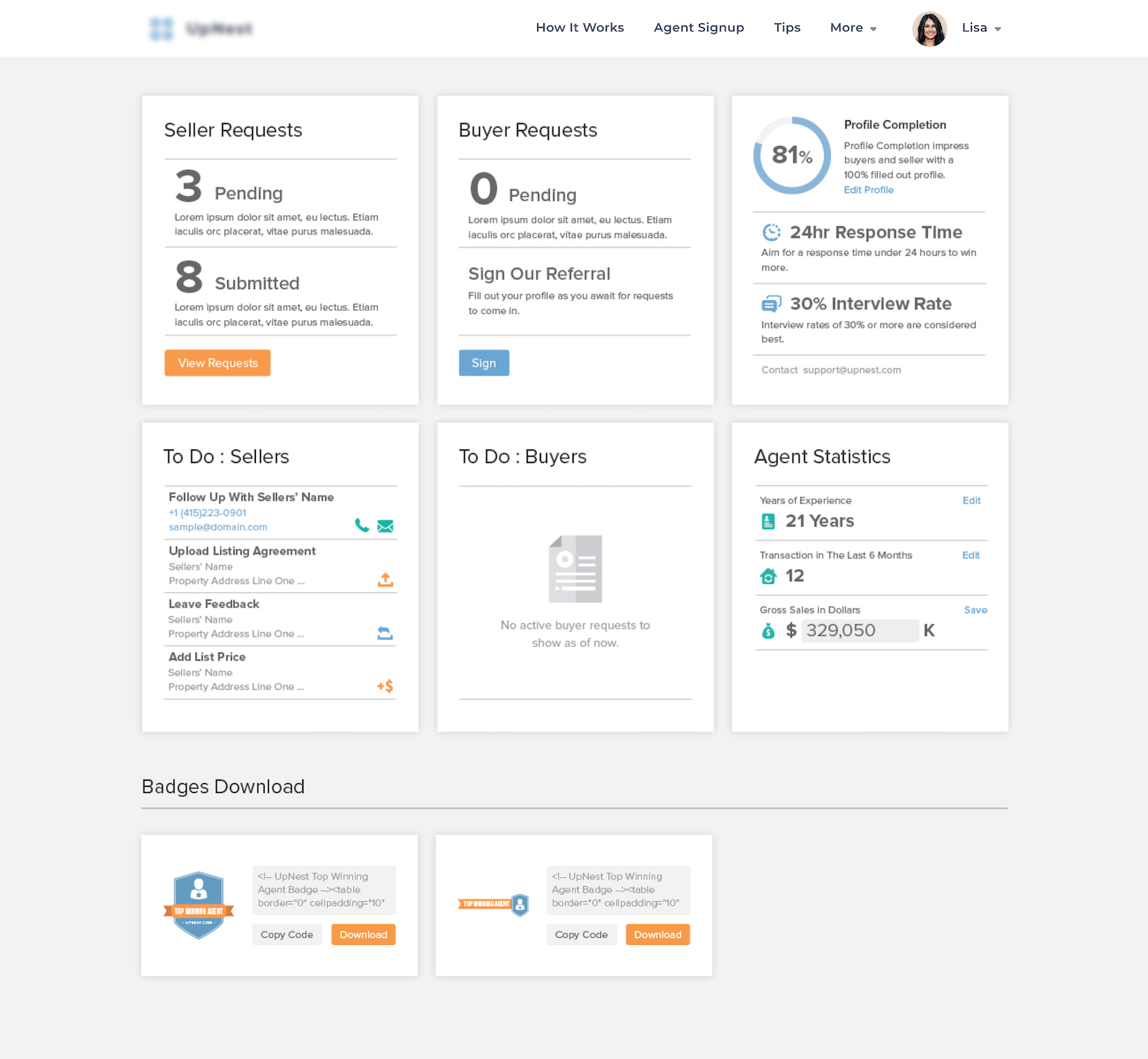
Realtor Dashboard
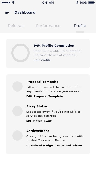
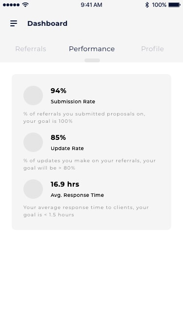
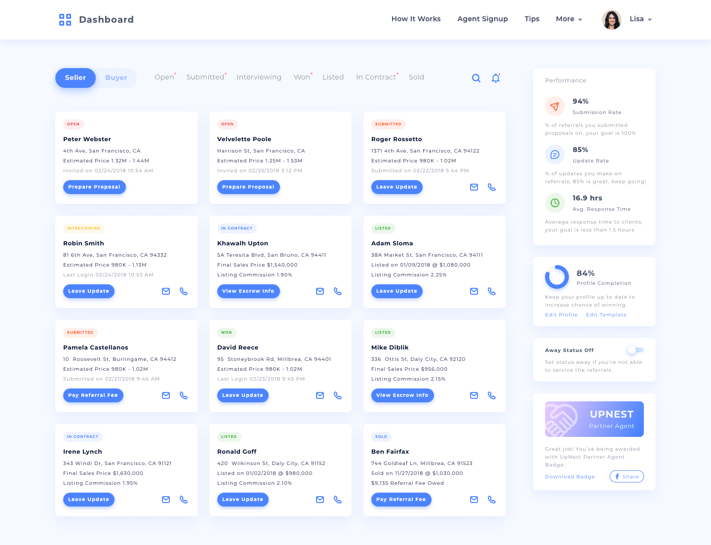
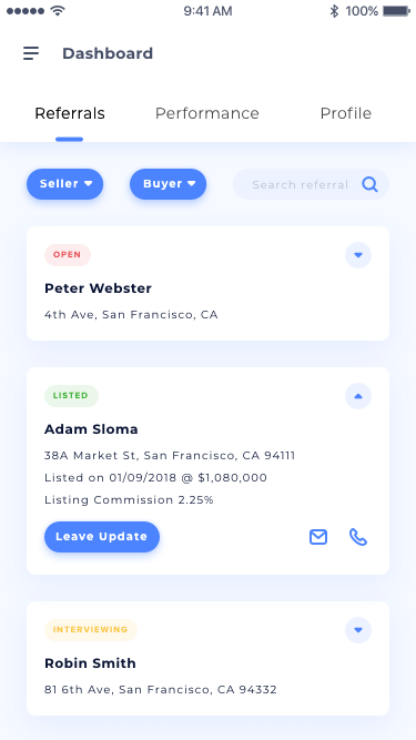
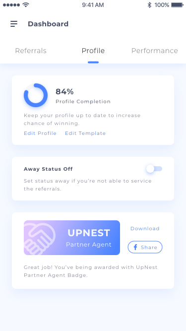
Dashboard for partner realtors to manage referral clients
Product Designer & Front End Developer
The Background
Back story
As a marketplace connecting home buyers and sellers with top local realtors competinge for their business, UpNest has gained many partner agents—and their deal volume has skyrocketed.
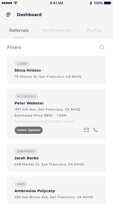
While our partner agents were familiar with the dashboard released three years ago, they tended to use other services or manually tracked the deals sent by UpNest as they found little value in the dashboard. Further, a dashboard-like mobile app for partner realtors was an essential item in the product roadmap. Thus, in 2018, we decided it was time for an upgrade.
My contributions
Strategy development
Worked with partner realtors as well as operations and sales teams to align content strategies with a clear and inspirational vision.
User research
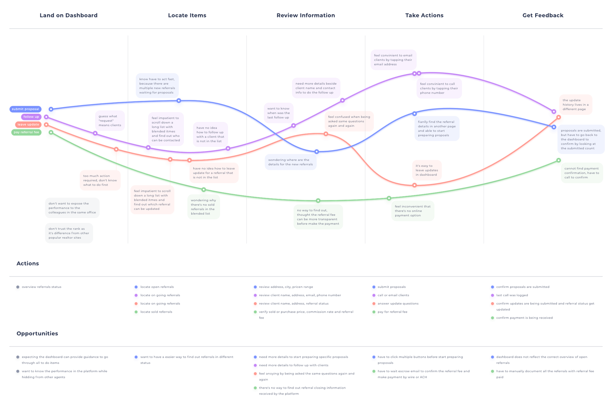
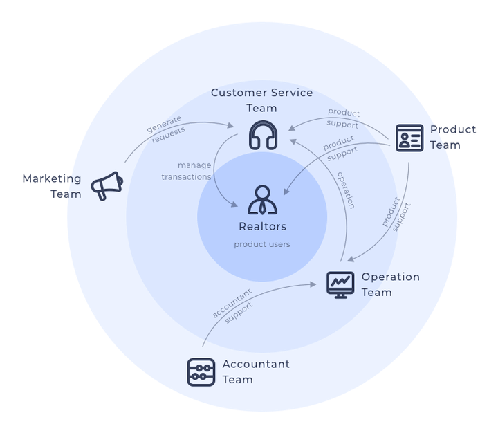
Observed user behaviors through analytics (Google Analytics, Mixpanel, Jaco, Smartlook, and more), conducted user interviews, analyzed NPS surveys, social media comments, and complaint tickets to extract the key issues, and finally compiled user scenarios to help define pain points and gain alignment in decision making.
Design execution
Worked solely on the design, iterating it based on usability testing and feedback from agent partners and internal departments.
Development and project management
Prepared the product requirements document (PRD), planned and managed the project, worked with other engineers to implement the features, and conducted internal quality assurance (QA).
Research & Analysis
Understand the complaints
Locating the pain points among the complaints and tracking data was a priority.
As I went through all the analytic data and comments from NPS surveys, and social media, I realized many issues had been resolved or no longer existed due to rapid product iterations. Six one-on-one interviews with partner realtors helped me narrow down the scope of the data to the preceeding six months. The key findings of realtors’ requests were:
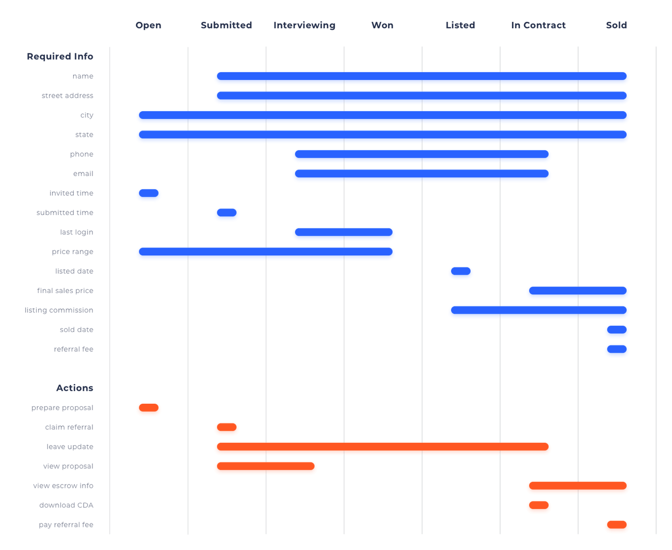
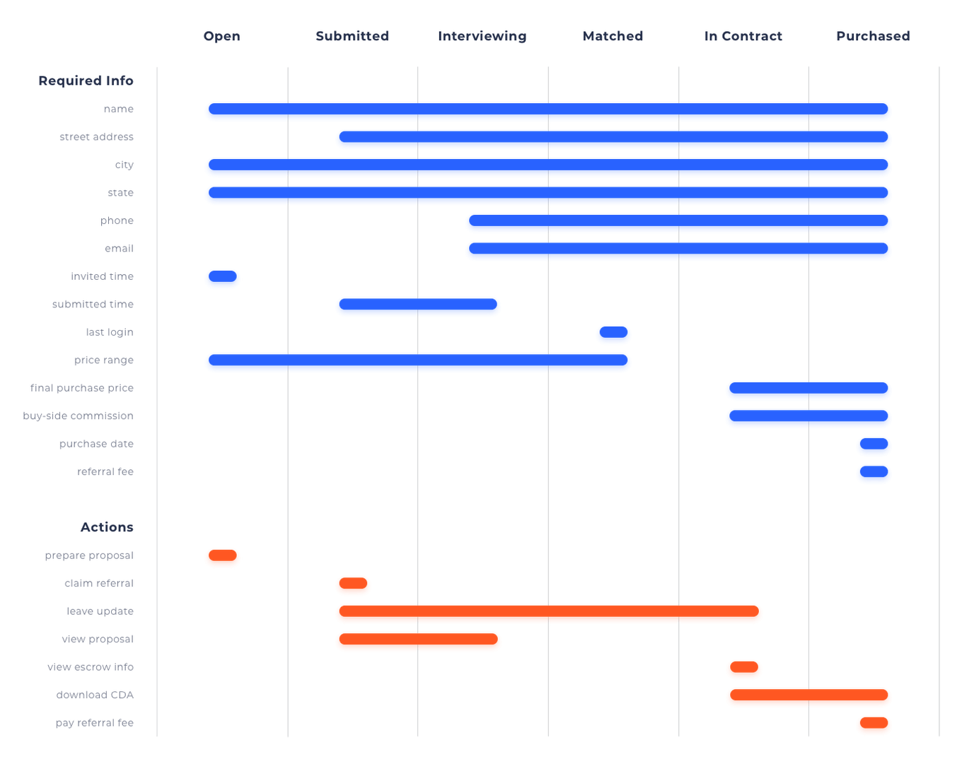
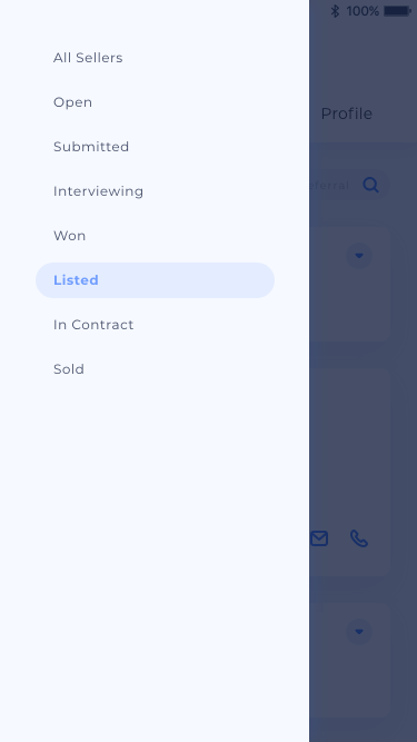
- The user needs to be able to manage the deals under different request statuses: open, submitted, interviewing, won, listed, in contract, sold/purchased
- The user needs to be able to submit proposals for new referral clients as soon as possible to increase the chances of getting hired
- The user needs to be able to follow up with clients via emails and calls quickly
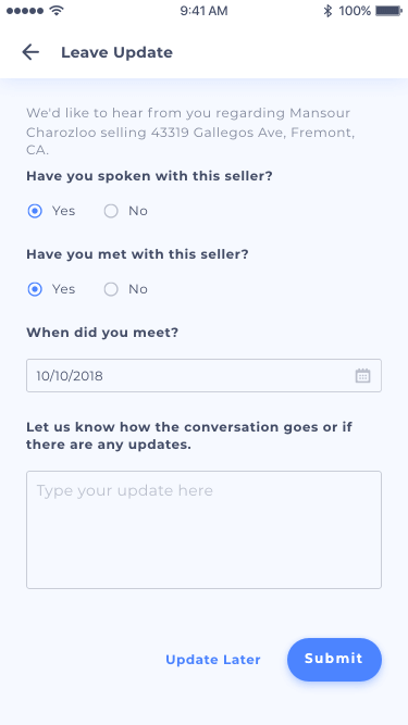
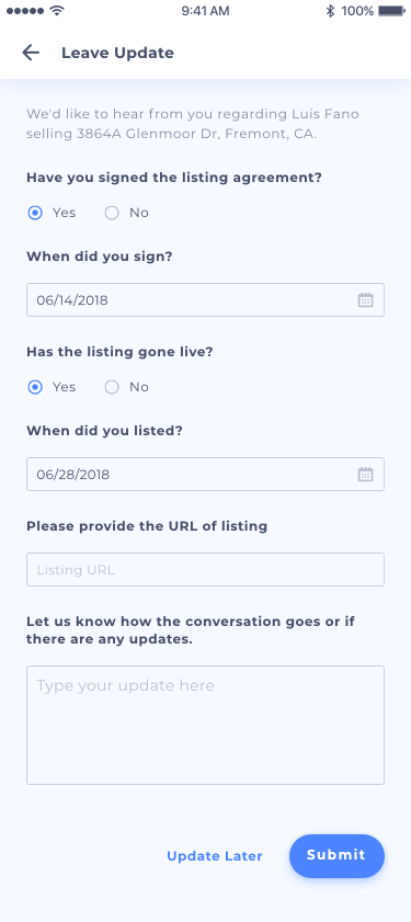
- The user needs to be able to leave feedback accordingly based on the status of each deal
- The user needs to be able to search for a specific deal with a piece of memorizable information
- The user needs to be able to track referral fee payment
To maximize the benefits of the new dashboard, I also included two requests from the sales and accounting teams in the design requests:
- Have agent partners leave feedback or call the sales team quickly to give updates on each deal
- Move the referral fee payment from checks to the online methods, and automate the demand letter process
The Proposal
Setting up the project goal
After requesting review and analysis, I set up the project goal, (improving communications between agent partners, their clients, and our platform utilizing a new realtor dashboard). The goal comes with four objectives:
Intuitive Navigation
To provide agent partners a navigation system to manage, locate, and follow-up on referral clients
Smarter Update
To provide agent partners a smarter feedback system allowing them to leave deal updates effortlessly
Faster Payment
To provide agent partners an online referral fee payment option and give them access to track the payment status
Better Performance
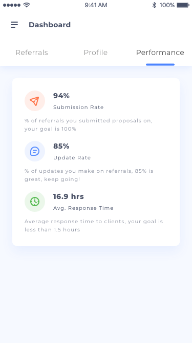
To provide agent partners a performance report and guide them in ways to improve their performance and conversion rates
The Ideation
Track all deals at a glance
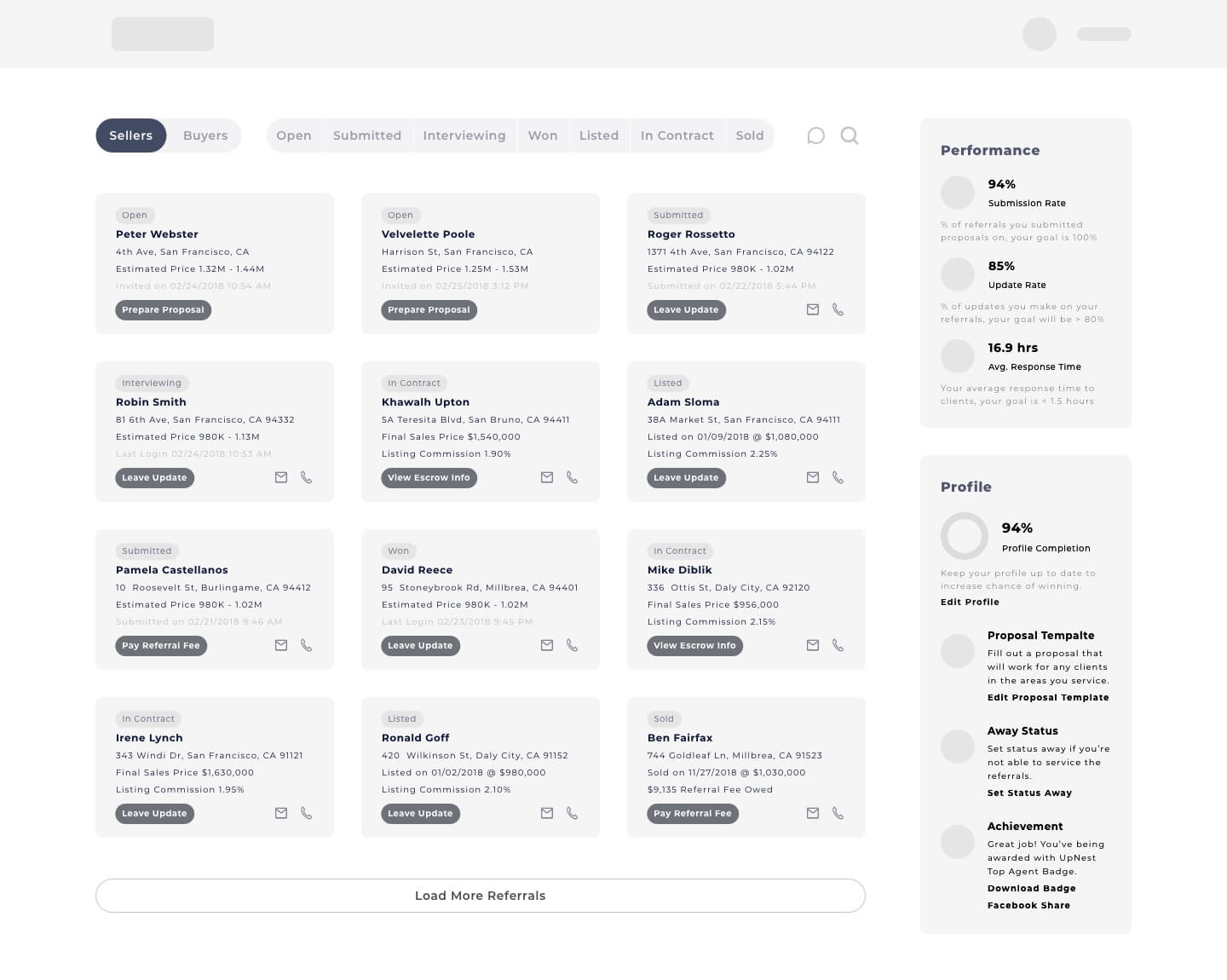
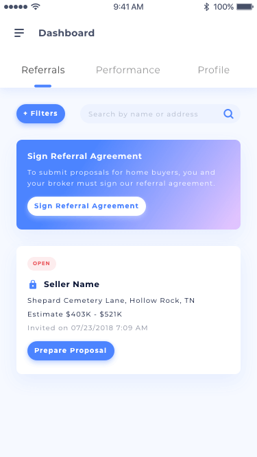
Realtors are doing business with clients, not a bunch of lists with different tasks (which is the old dashboard presented). With an eye towards increasing conversion and retention rate, I reformed the dashboard to a customer relationship management (CRM) tool for the agent partners, giving them the capability to filter and search for specific referrals, contact clients directly from the dashboard, and leave deal updates.
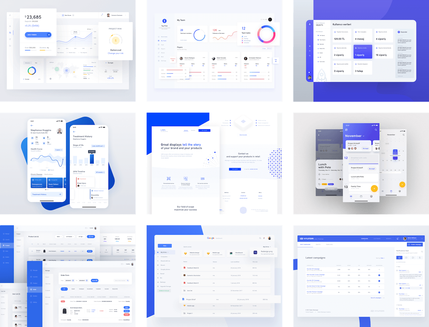
Collecting moodboard
Creating a CRM system from scratch sounds exciting. However, there are awesome CRM systems out there for inspiration, thus I created a mood board to provide a better vision for the redesign.
Redesign
Product thinking before pixels
Content inheritance
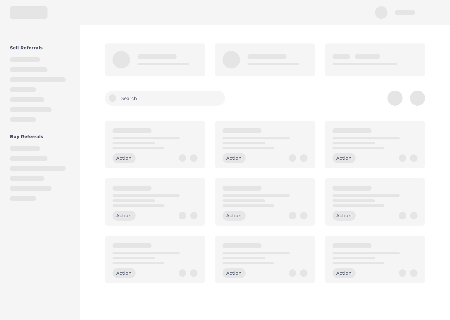
As a redesign, the essential content of the old dashboard is required to be inherited. Instead of compiling the deals that require the same action, I grouped the basic information and required actions based on deal status. Then introduced filters and search features to manipulate all the deals.
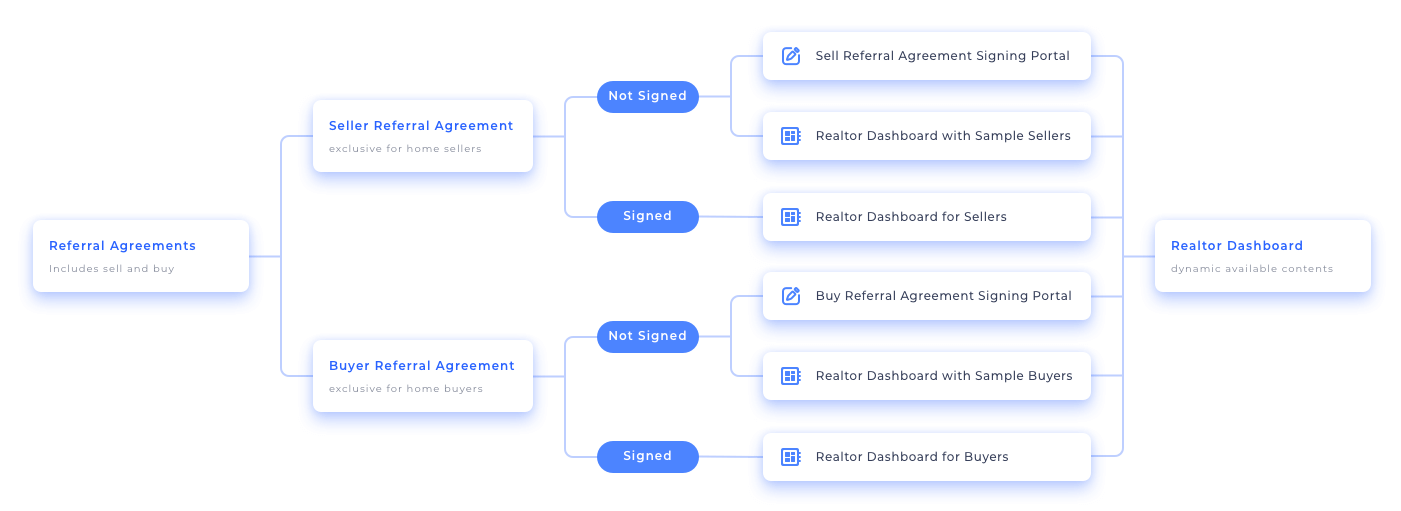
Map out business logic based on account levels
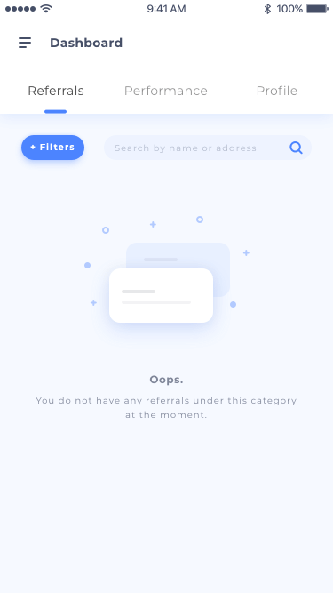
It’s ideal to have multiple active transactions and a nice data visualization chart for users. Most likely, though, users will have no deals under a certain status, lacking data for a performance chart, and may not even have the referral agreement signed. The logic chart plays a key role to cover these scenarios.
Below are the four major scenarios and their corresponding accessible contents:
Write down information from all screens and their possible states
As a deal moves from one status to another, the focus is shifted. After going through all seven deal statuses for home sellers and six deal statuses for home buyers, I listed out the key information for each status. This information provides agent partners accurate recall anchors and corresponding actions, and they were further simplified and compiled as three items for all the statuses.
Scope out the smart feedback system
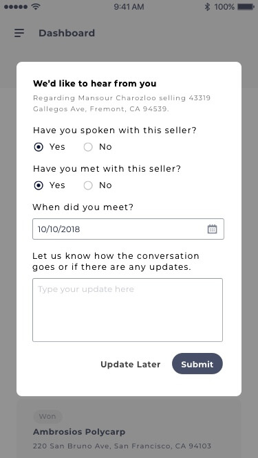
Instead of asking the users the same set of questions repeatedly based on deal status, I broke down the question sets into individual questions and reworked them based on milestone events—regardless of the deal status.

fig. home sell feedback system. *The diagram was shrunk for confidentiality reasons.

fig. home purchase feedback system. *The diagram was shrunk for confidentiality reasons.
Prototype & Test
Start by building Minimum Viable Product (MVP)
Design development
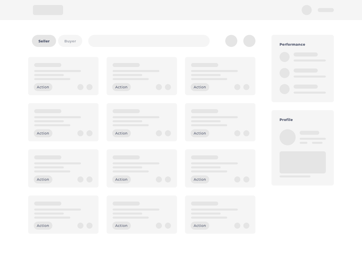
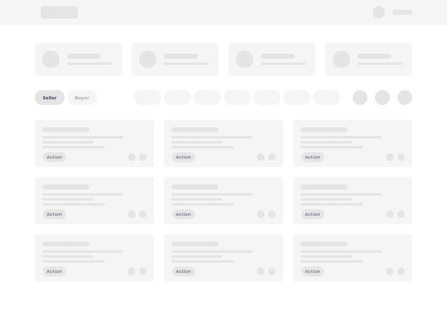
After whiteboarding, the iterated wireframes were tested rapidly among our internal departments, and I gathered valuable feedback (as they only needed to complete three tasks). They had trouble finding the deals needing an update, they couldn’t determine all of the labels on the action buttons because they weren’t expressing clear meanings, and they informed us we needed to reduce the load times of the dashboard (as a realtor might have dozens, or even hundreds of, active deals). All feedback was incorporated in the new version of the design.
Create prototype
The first prototype was made in InVision. It could switch between deals of home sellers and buyers, filter deals based on status, and leave updates. After six interviews with selected agent partners via screen share and video calls, I refined the design and moved to high fidelity mockups.
Development & Management
Break down the plan
Due to the project size, the cooperation level it required, tight schedules and resources, synchronizing the understanding of all project members was crucial as the work was handed to the developers.
Prepare Product Requirements Document (PRD)
I started to prepare a product requirements document and hosted development meetings with on-site and remote engineers. The document defined the goal and objectives of each feature, which included feature description, development phases, and detailed subtasks (such as replace endpoints, modify queries, create components and so on). I treated the PRD as a living document syncing all project members’ efforts and progregress by asking everyone in the team to perfect the requirements and rules during the development.
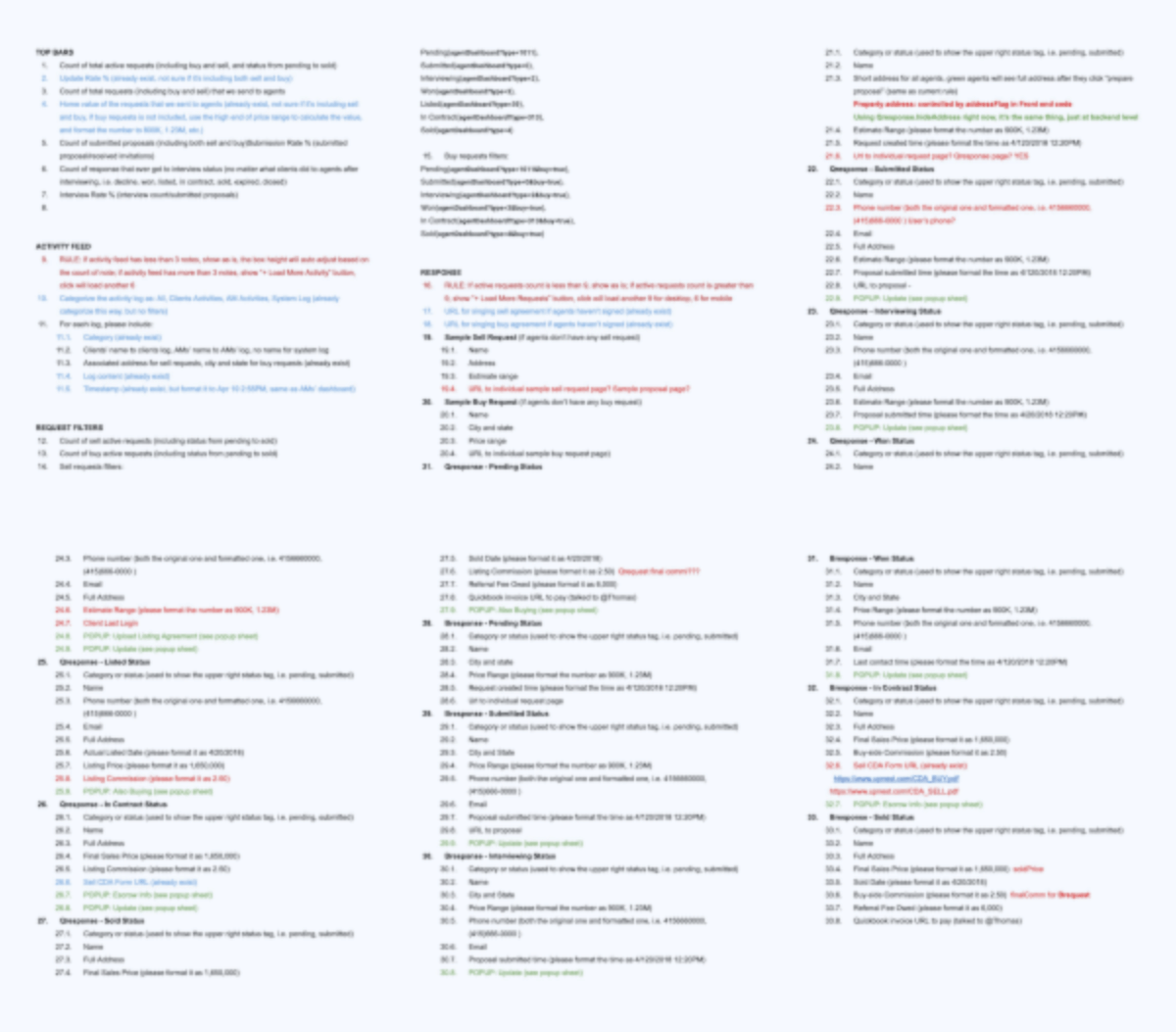
fig. data structure section of PRD. *For confidentiality reasons I have blurred the image.
Project management and quality assurance (QA)
I worked with three engineers on 26 tasks during three weeks of development, and we performed an alpha release and a beta release for user testing and QA. I listed-out all the test cases for Selenium automation testing and was able to use that to fix part of the usability issues identified.
Iteration
Released! Then what?
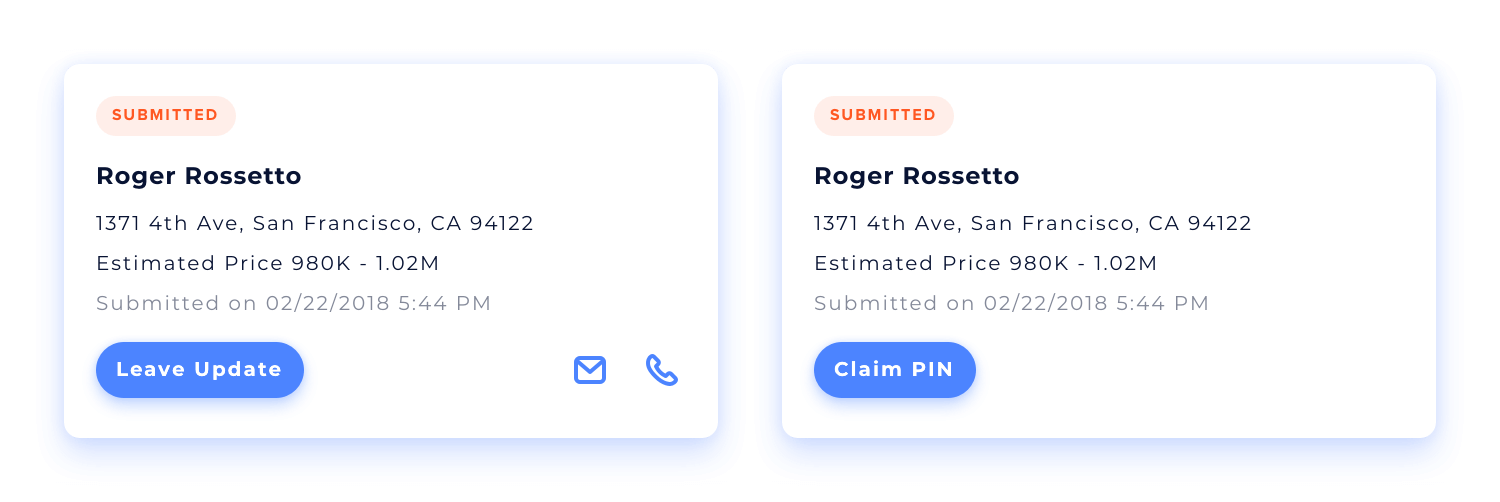
After the launch of the new realtor dashboard, I started monitoring the tracking data and gathered feedback for various iterations, including enabling users to view their submitted escrow info, and an incorporated referral claim (PIN claim) system which was introduced after the new dashboard launched. I'm sure the dashboard will have more iterations in the near future as the company is expanding and growing rapidly.
The Revisit
Revisit the numbers
The dashboard redesign has had a great impact on improving the communications between agent partners, clients, and the platform. However, the power of the product has its limit. For instance, the average time to close a deal trends down, and then stops. Further examination of the data finds it’s due to the standard legal procedure of a real estate transaction (which is out of realtors’ control).
Below is the key metric at the time of writing (three months after release):
- Partner realtors reach out to clients 2.24 times faster
- The average time to close a deal decreased by 5.2%
- Deal update rates increased by 16%
- Online payment rates increased from 0 to 2.1% (new feature)
* For confidentiality reasons I have omitted the actual values for these metrics.
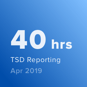
When converting the number above to actual hours, it saves the sales, operations, and accounting departments 32 hours a day!
What I have learned
A prototype is worth a thousand words
Being in a fast-paced product team, I found us in great discussions producing many enthusiastic ideas and suggestions. But they do not lead anywhere unless the ideas get translated into prototypes, which provides a way to quickly validate the concept and move forward.
Leave Dribbble behind
Lots of work in Dribbble have nice pixels with lovely pictures, but that’s not what real users need and use. Maybe Dribbble is the best place to show off design and attract new clients, but it’s certainly not the place to create a design for. The first version of the redesign has a nice visual performance report at the top, but users cannot do anything with that, as they are looking for action items in this precious space.
Launching is only the beginning
I had difficulties accepting the reality of the realtor dashboard when it was launched, as I knew the missing pieces and what had been compromised in terms of performance and usability. Now I realize the insisting the product bee perfect when it first releases doesn’t matter that much—the success of the dashboard hinges on whether if it provides users a great tool to manage their deals and how much time they save. What I should do is listen to the users to keep perfecting and iterating the product, launching is only the beginning.


