Staff Experience with Staff Hours Application
A Usability Evaluation of a Cognos 11-Based Time Tracking System
Research with Fangyi Huang
Introduction
The report serves as a guide to improve the development of a client organization’s internal system, Staff Hours, an internal time tracking system based on IBM Cognos 11. The Cognos reporting system is a tool being used to allow the project manager to assign project hours to their designees and monitor and manage the staff hours in relation to a specific project. Managers also have access to their subordinates’ information through Cognos for staff career planning. All client’s staff have Cognos accounts, and after login with their username and password, they are prompted to select the month range of their interest and submit a staffing report. The staffing report displays the projects the team have charged to or are planned to for coming months, and the report is often used by staff for their time management. In January 2019, Cognos 10 was upgraded to Cognos 11 in the cloud. Information about the system updates, new login instructions, and video tutorials were disseminated via organizational emails.
While Cognos 11 can be used for various purposes (for example, project managers are the heaviest users of the system for budgeting), this study focuses on a most common experience of all users—generating an employee’s staffing report using Staff Hours system. From the perspective of end users, we are interested in learning what they think about the updated Cognos system and what areas could be improved to make their experiences more enjoyable. Special attention was paid to the efficiency of use because all 1,800 employees use it in the organization. As this is an internally-designed tool, if we could optimize the user interface design so what was once a three-minute task is now two minutes or less, then we’ve increased a person's productivity by at least 33%. From interviews with the participants, it was learned client organization staff check their staffing report monthly. Assuming all employees check their staffing reports every month, then one minute more efficient per month across 1,800 employees is equivalent to a total of 21,600 minutes or 360 hours (12 minutes per year * 1,800 employees = 21,600 minutes across all employees) annual saving in labor hours. In short, a thoughtful user interface design of a vital internal tool will not only make employees happy but may also increase staff productivity for the company.
For this evaluation, we purposefully recruited two experienced client organization employees who had used Cognos 10 before, and a new user, similar in age to the others but has never used an equivalent tool to complete a similar task. By attending to the needs of both expert users and new users, the future Cognos development should not only create a better user experience for the existing staff but also reduce training and support cost for those who are new to the organization.
To discover valuable insights directly from users themselves, we performed a usability test of Cognos 11 Staff Hours system, supplemented by additional activities, including a pre-test interview, a post-test interview, and a usability survey. We evaluated the quantitative and qualitative data, described the differences in experiences between the expert users and a new user, and drew out the issues concerning the Cognos 11’s usability. The evidence highlighted existing issues with Cognos 11. We addressed the issues and offered recommendations with mockups to resolve the problems.
Methodology
Efforts were made to recruit inclusive testers, including all levels of users. Ideally, the test participants should include users with low, middle, and high levels of knowledge of the system. Having testers with various system experiences represent the system’s target users and allows learning how to build a welcoming platform that is easy to use for both new users and expert users.
Participants
We recruited three participants for the usability study. One of them was not a client organization employee and had no experience with any staffing report system (referred to as “new user” in this report). The other two participants were experienced users (referred to as “expert users”), who were employed with client organization at the time of testing and had interacted with Cognos 10. None of them had used Cognos 11 nor reviewed any instructions or tutorials before the testing. The expert users had different levels of familiarity with the system; one had used previous Cognos for three years while the other user had one year of experience. The expert users reported using Cognos once a month to check their staffing report.
Procedures
For each session, we invited a tester to a quiet office that was free of distraction. The computer was open, but no application or web browser was currently in use. We briefly introduced the study to the tester and asked for permission for audio and video recording of the screen during the test. The testing began with a pre-test interview, followed by three tasks, a post-test interview, and ended with a short usability survey about the day’s experience. Please see Appendix 1 for the complete interview and usability test protocol.
Semi-structured Interviews (a pre-test and post-test interview)
The semi-structured interview was divided into two parts—a pre-test interview and a post-test interview.
The ten-minute pre-test interview included basic demographic questions and questions about previous interactions with the Cognos system. More specifically, users were prompted to recall their last interaction with Cognos 10. The pre-test interview was only conducted with expert users, not with the new user.
The five-minute post-test interview asked users to reflect upon their experiences with the latest Cognos system as they completed the usability tasks, highlighting the features they liked and disliked, and recommending any future improvements (if any).
Usability Test
The 15-minute usability test consisted of four tasks, with each task representing a common context in which the user would need to generate their staffing report.
- Task 1: Review the actual hours you've charged to the projects from January 2018 to December 2018
- Task 2: Clear Task 1's result and prepare to run another report
- Task 3: Check how you are staffed in the first half of 2019 and prepare a report to send to your staff manager to discuss your coverage
- Task 4: Identify the months in 2019 in which projects are not sufficiently covered
Task 2, which was to clear the report generated by the previous task, was not included in the original usability test protocol. It was later added in the analysis after observing a significant usability challenge the testers had while moving from Task 1 to Task 3.
We guided testers through the tasks while recording the computer display. We encouraged testers to verbalize their thoughts and actions, and we asked follow-up questions throughout the process.
Usability Survey
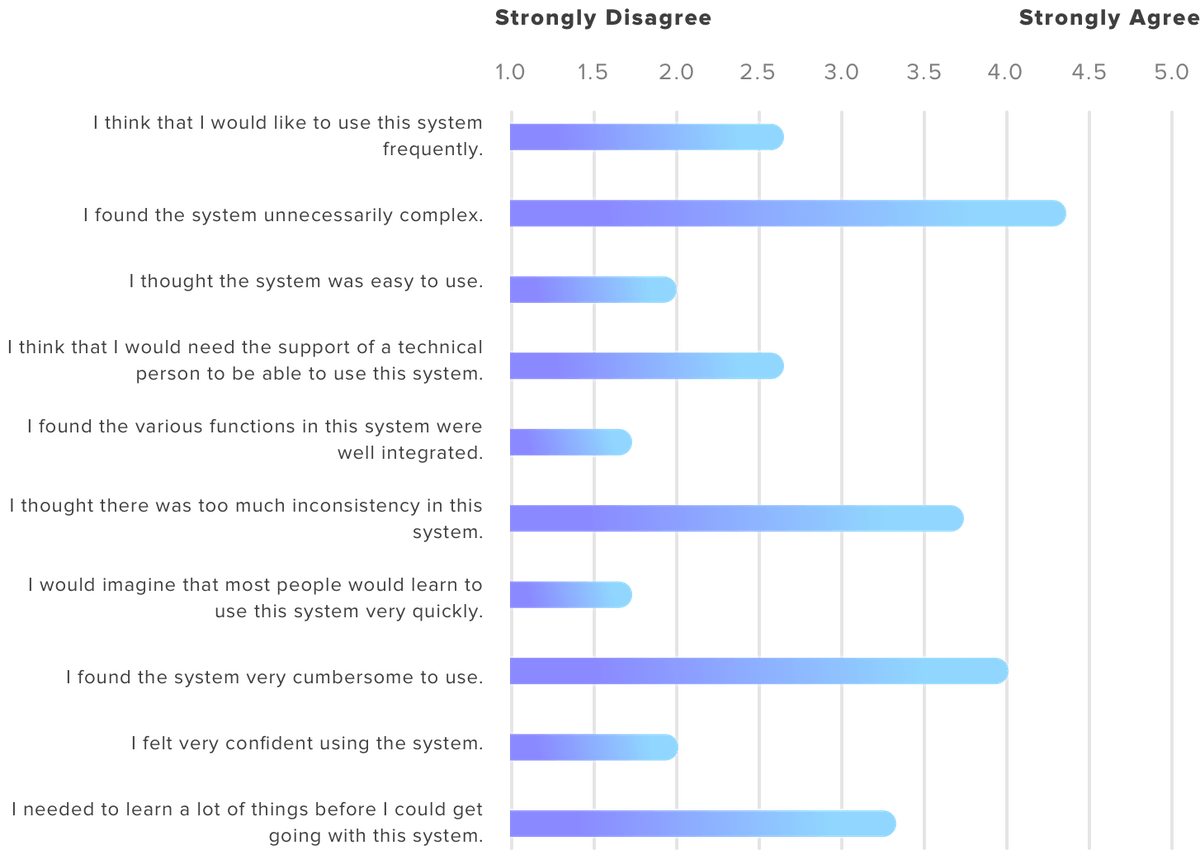
Testers completed a usability survey after completing the post-test interview. The survey instrument is the System Usability Scale (SUS). The survey had ten questions, and the testers were instructed to rate their agreement to each statement on a five-point scale. The reliability of the scale has been validated through its use in over 1,300 publications. SUS is easy to administer and can be applied to a small sample while yielding considerably reliable results1. See Appendix 2 for the complete survey items.
The inclusion of a usability survey provided additional quantitative data on the evaluated system. The use of a mixed method allows us to supplement the limitations of a single research method, triangulate the findings from different data sources, and enables us to identify the consistent pattern in the data and provide verification on our conclusions.
Analytic approach
Semi-structured Interview & Usability Test
We listened to the audio recordings of interviews, reviewed the videos of usability testing, and we used affinity diagrams to organize and group the qualitative data. We documented the facts, user quotes, and our observations relating to usability issues onto adhesive notes. Each note was evaluated, and similar notes were grouped and categorized to represent a broader usability issue. The groups were ranked based on their relative importance to each other, and the discussion of usability issues in this report focused on the topics that we considered as the priorities. Also, to explain part of the observed issues, we performed a brief heuristic evaluation of Cognos 11 (that is, we compared the Cognos 11 design against the Jakob Nielsen's ten design principles2).
Usability Survey
The raw scores were converted into percentile ranking based on the scoring manual, and individual results were aggregated. Please refer to Appendix 3 for the aggregated results at the item level. Data were interpreted in the following discussion by comparing to the industry standards.
The next section details our study findings and offers recommendations for future improvements. It begins with a summary of the users’ overall experience with the system, follows by our findings grouped by the usability issues in the order of importance. We then offer suggestions and provide mockups to illustrate them. As discovering problems is central to this report, note we did not delve into the limitations IT had to work with while developing the tool using the Cognos platform. The suggestions offered in this report may be difficult (or even impossible) to implement on the platform as it currently exists. Therefore, further research is needed to understand what the current platform constraints are before redesigning the Cognos 11 Staff Hours application. In parallel, it may be of interest to client organization to evaluate the appropriateness of using Cognos 11 for time tracking, and or if there is a more cost-effective tool available that better suits client organization’s needs.
Findings
Overall experience
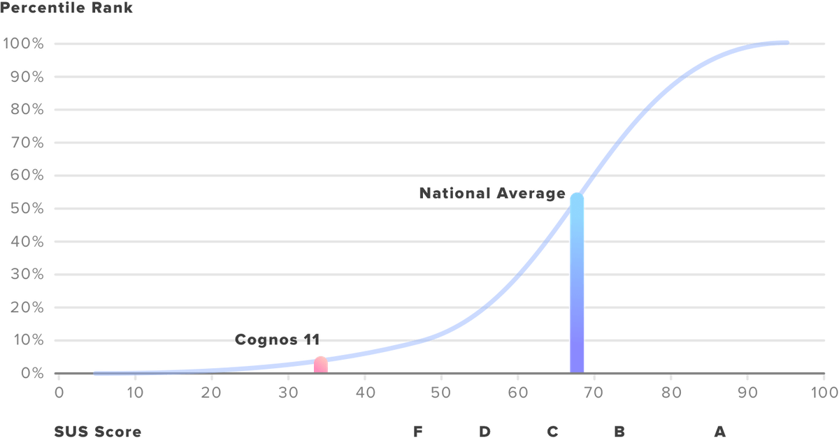
From the pre-test interviews, we learned the expert users had a neutral attitude toward the previous Cognos, and they expected the new version would be more user-friendly. However, in the post-test interview, the expert users stated they were not happy with the changes. As one tester remarked “I thought it is going to be easier [in the new version], but it wasn’t.” The inclusion of the SUS survey material allows us to compare the evaluated system against the national benchmark of usability. The average SUS score from 500 studies is a 683. The post-test survey yielded an average score of 33 for Cognos 11, well below the national average and falling into the SUS category of the worst tier. Figure 1 shows how the percentile ranks are associated with SUS scores and equivalent letter grades. The blue line indicates the national usability average of a given tool, and the red line indicates where the Cognos 11 stands compared to the national benchmark.
Finding 1. Information Architecture is unnecessarily complex.
Good Information Architecture (IA) design organizes contents so users can easily find everything they need without significant effort. Unfortunately, the current Cognos constructs its contents and navigation system in a way that is inconsistent with user perception. The testers gave an average of 4.3 out of 5, in which 5 represents “strongly agree,” to the survey item, “I found the system unnecessarily complex.”
In our study, Task 2 (clear Task 1's result and prepare to run another report) examines if the user can successfully navigate across pages. Task 2 captured the usability challenges regarding Cognos 11’s IA design. After running the first report, users had extreme difficulty navigating back to the home page (the report inquiry page). Two users were able to return to the home page by trial and error. However, one user decided to give up after spending three minutes and 18 seconds trying. Overall, the completion rate of Task 2 was 67% (two out of three) and the average time spent on the task was two minutes and 11 seconds (during which 14 errors were made, on average).
While completing the task, the expert users heavily relied on their experience with the last system version, whereas the new user spent more time reading the explanatory text of the buttons before clicking them. The expert users first looked at the right upper corner of the page, where the “return” button used to be in the previous interface version. When they realized the button was no longer available, they looked at the left panel, hovered over the available buttons one-by-one, and read the explanatory text. One user stated she was looking for buttons that say “clear,” “return,” ”back,” or another action suggesting removing the on-screen results or redoing the report. All testers repeatedly clicked on the buttons such as “refresh,” “cancel,” and the home icon even after several previous unsuccessful attempts.
Upon accidentally discovering that he could clear the report by going to the “team content” folder, the new user expressed frustration with such folder organization and commented that the information structure made no sense to him.
A heuristic evaluation of the current interface suggests a severe violation of the visibility of system status. The site did not provide any visible navigational aids—such as menu maps, place markers to indicate where the user is in the system. The lack of navigational aids created a significant barrier when users navigate between pages.
Recommendation
- Reconstruct the site IA. Our analysis reveals an urgent need to regroup site content in a way that is understandable to both expert and new users.
- Provide feedback to let users know where they are in the website by offering navigational options. Feedback provides users with the information they need to understand where they are within the system, and for proceeding to the next activity.
Finding 2. The staffing report does not address user needs directly.
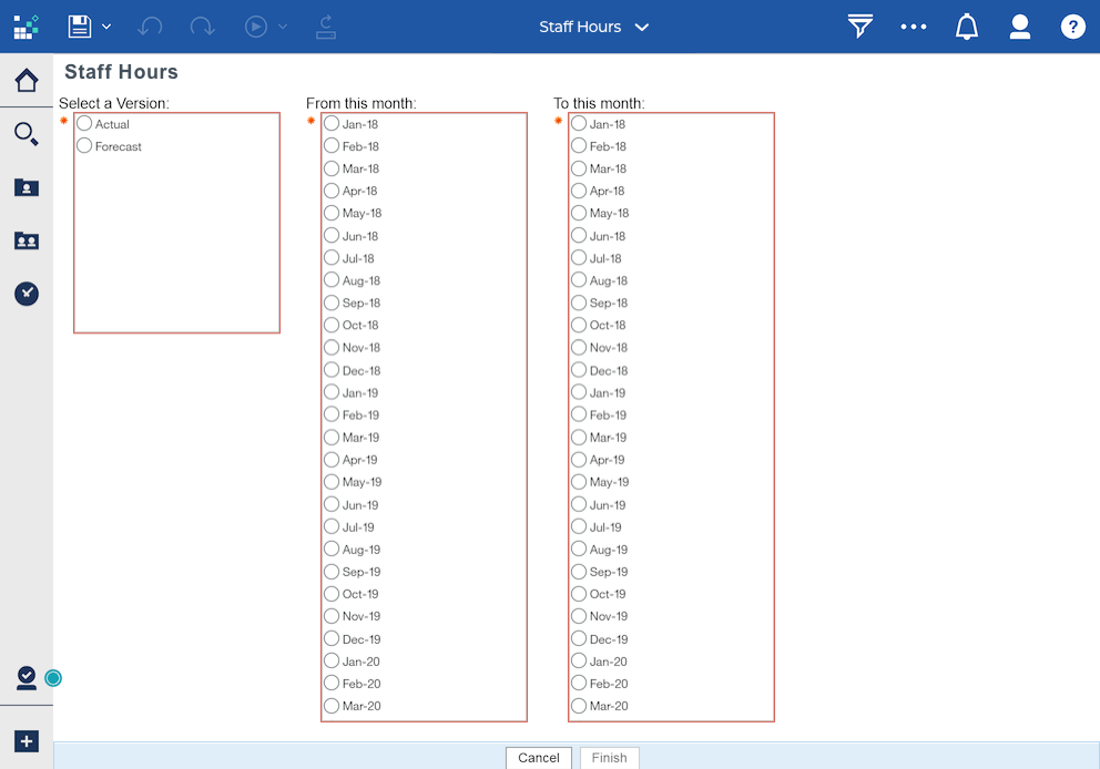
The goal is to use the system is primarily to monitor users’ staffing coverage. To do so, users would either pick “Actual” or “Forecast,” depending on whether they want to see their charged hours in the past or budgeted hours for coming months. They need to specify the date range on “Staff Hours” page (as seen in Figure 2) and submit the request to get a report.
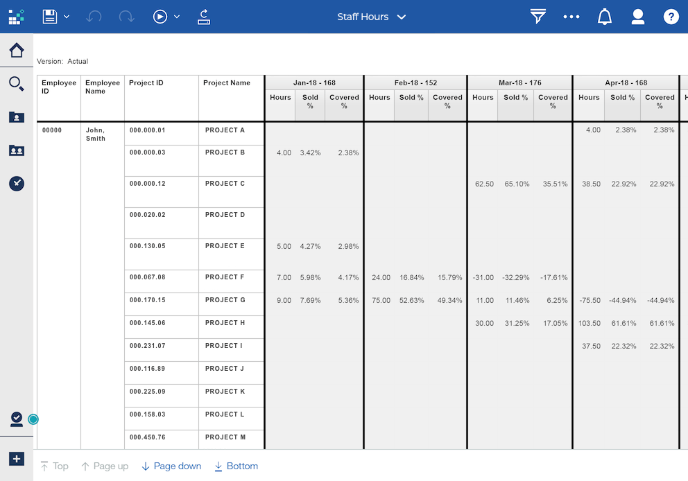
While the experienced users remarked that they have gotten used to this report format (seen in Figure 3) and did not have a problem understanding the report, some improvements could be made to improve the efficient use of the report.
A better report design should take a step further and provide information that directly suits user needs.
Informed by the post-test interviews, to truly make use of the report, there are several additional things users would have to do after getting it. The following describes the common user goals along with the procedures some users following along after receiving the report:
- Identify the coverage gap
- Users take a note of their % covered for each month, then have 100% minus the percent covered to calculate the % not covered;
- Since not every month has the same number of working hours, users would have to check how many hours the 100% represents in that month;
- Users translate the % not covered into hours and identify how many hours they need to be staffed for the month they are not sufficiently staffed;
- Look for additional projects/tasks if needed.
- Plan work for the month and track charged hours against their billable time
- Users take note of their allocated project hours for the month;
- They divide the monthly total hours by 4 or 2 to calculate how many hours they can charge to a specific project each or every two weeks (such as one pay period) respectively;
- Users notify the project director if they see a discrepancy between their budgeted hours and workload requirements during the month.
- Share the staffing report with the staff manager
- The staffing report is commonly used in the staff meeting where staff managers review the report with subordinates. Task 2 involved a component of assessing the ease of report sharing. All users were able to complete the task. However, one user completed the task but remarked that she was unsure if the action was a success. In average, users spent two minutes and six seconds on the task, suggesting a significant usability issue given the simple nature of the task. As it intentionally did not specify what format of the report to share, users were free to choose whichever format was more accessible for them to complete the task. Using the ‘think aloud’ technique, we observed a user preference to share the report in the Microsoft Excel format as it allows the users to work with the report numbers and perform additional calculation if needed. However, none of the users were able to share the report in the Excel format successfully.
- Keep informed of the coverage change
- In the post-test interviews, users expressed their wishes to have some features added to the report to keep them informed of any changes and stay in control of their time. The features they would like to see included are:
- a. An activity alert if any project directors update their budgeted hours;
- b. A notification if a team member’s estimated hours exceed a preset threshold;
- c. Include a mechanism to prevent project director from budgeting more user’s available hours, so that user’s coverage does not end up being more than 100%.
A good redesign of the report ought to address the user goals by presenting additional statistics about users’ coverage gaps, helping users to plan for future work against budgeted hours, allowing for easy report sharing, and providing tools to keep users informed of their staffing status.
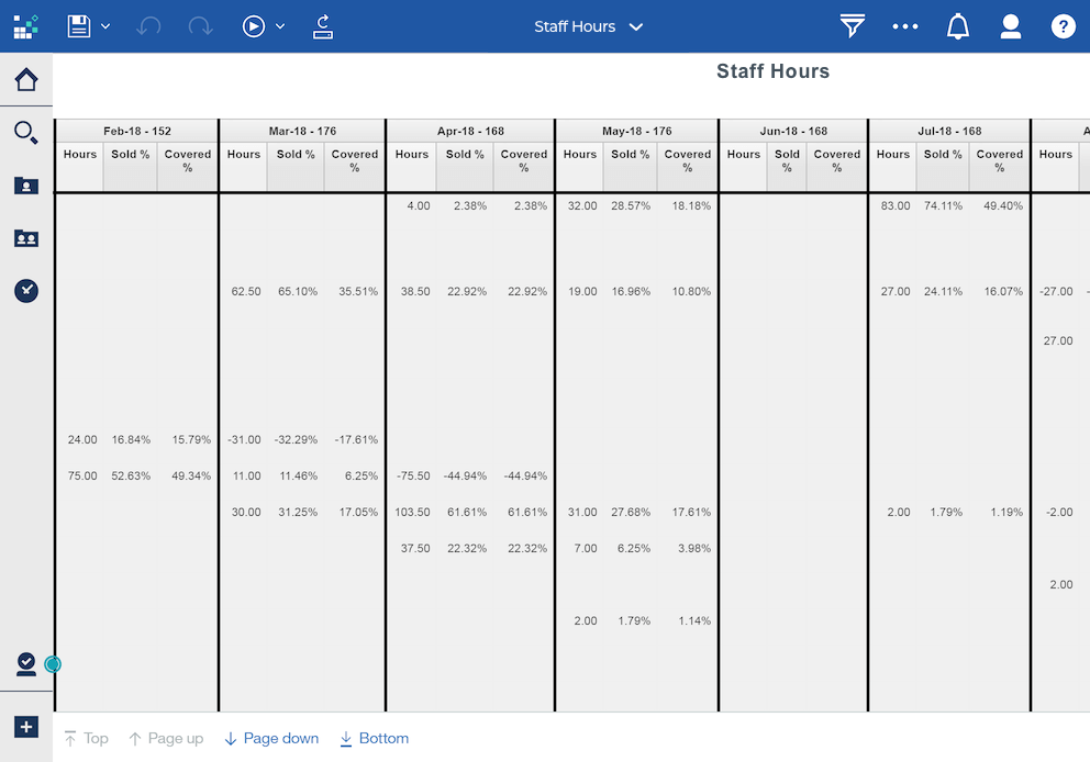
Also, we compared the report interface against Jakob Nielsen's ten general design principles, and two usability issues stood out. One is a severe violation of Nielsen’s sixth principle (recognition rather than recall). The report is generated in a table format where each row represents a project, and each column represents a month. An issue would occur if the report includes many projects (many rows) over several months (many columns), that is the table becomes very large to view and reading requires scrolling.
The row and column headings are not frozen, so when users scroll down or scroll to the right, they have a hard time knowing which project or month the value is referring to (see Figure 4). A good report interface design minimizes the user’s memory load by making the referring months and projects visible so that the user does not need to scroll back and forth to figure out what the values refer to.
Another violation of the design principles is Nielsen’s second (match between system and the real world). The report uses internal terminologies and presents staffing coverage in percentages rather than hours, both of which do not effectively communicate to users using familiar language. During the testing, the new user stated he did not know what “sold %” and “covered %” means, nor did he understand how these terms are distinguished from each other. Therefore, a better report should use plain language and convey the information in a manner that is easily understandable to both expert users and those new to the system.
Recommendation
Redesign the report by incorporating information or features that directly address user needs.
- The information should help users to answer the following questions:
- How are the user’s hours allocated across projects?
- What is the user’s coverage gap in both percentage and hours?
- What are the outstanding months in which the staff is either under or over necessary levels?
- The new features should allow users to:
- Know how they should create their monthly work plan based on the budgeted coverage;
- Share their staffing report easily with a staff manager or project directors;
- Keep updated of their coverage changes if there is any.
Finding 3. Several design choices prevent efficient use of the system
The system should enable users to finish a task in about one minute to create a good user experience4. Task 1, which asks users to check how they charged to the projects last year, is a considerably simple task. User needs to select “Actual” from the menu to check their charged hours in the past, then specifies the month range and click “Finish” button to generate a staffing report. The average time testers spent on the task is three minutes 12 seconds, comparing to the one-minute benchmark. Also, Task 2 (clearing the report result to reset the search) took users an average of two minutes 11 seconds—too long to produce a positive user experience.
The are several factors that contribute to the slow down.
Issue 1: Non-standard visual representation confused users
We observed some errors made during the usability tests were due to participants’ misinterpretation of icons and buttons. The case is especially true for the new user as he spent time exploring the interface, trying to make sense of the visible buttons and menu before working on the task. The new user hovered over the icons, paused, and thought if those were relevant to the task. If the system had used more standard visual representations, the new user could have glanced over, knowing they are not relevant and then move on to the task.
The non-standard icons created additional obstacles when users had to find solutions from the system. In the scenario of Task 3 (create a staffing report and share with the manager), none of the testers were able to share the report on their first attempt. All users’ first reaction was to click on the “Save” button located in the top left area of the window after the report was generated, but the system pops up an error message when the button is hit. Users had to find another way to save and send the report. The non-standard icons became a usability issue, and users had to do some exploration within the system.
As some of the icons used on the site are not commonly seen elsewhere in other applications, and users reported feeling uncertain about the icons, they spent more time reading the label text and yet interpreted the same icons differently. Moreover, the familiar icons used on the site do not convey the information users typically associate with them, missing the point of using the icon in the first place.
Recommendation
Further usability tests should be done to test the icons for recognizability and gauge what users expect the icons to stand for. Research the commonly used icons and replace the ambiguous ones with those which accurately communicate their function.
Issue 2: System response time is too long
It was reported that the website’s response time is beyond acceptable. The think-aloud method allowed us to tap into the user’s thinking process when they waited for the system to respond. An expert user waited patiently and commented that “I will wait because I know it'll just take a minute or two for the report to pop up... I don’t expect an instant report.” The other experienced user said, “It usually takes about ten minutes, maybe is too long, (because I) want it to be done in two minutes.” Table 1 shows the average system response time of each task.
While it didn’t take ten minutes to receive a report as perceived by the user, the system certainly took longer than expected to produce a result as users may normally expect from a simple task like this.
Staff at client organization have no alternative options but to commit to using Cognos. The extended system response time creates unpleasant user experience after ten seconds, “the average attention span is maxed out, and the user does not retain information in short-term memory to easily resume the interaction once the computer finally loads the next screen.”5
Also, the current wait message (a mostly empty pop-up window with a spinning circle in the middle and a cancel button under the spinning icon; see Figure 6) does not deliver enough information about the report status to users. Users were unclear how long they needed to wait and, when they were waiting longer than expected, they were not sure if the system was still running or simply not responding.
Recommendation
If possible, the system should strive to reduce its processing time to less than ten seconds. If that is hard to achieve, use progress indicators or estimates to keep users informed of their waiting time or even allow the system to send a report to the user’s email once the report is complete. Users then can choose to involve in other activities if they know they must wait for long periods and let the computer complete in the background.
Issue 3: Many visible irrelevant options on the page
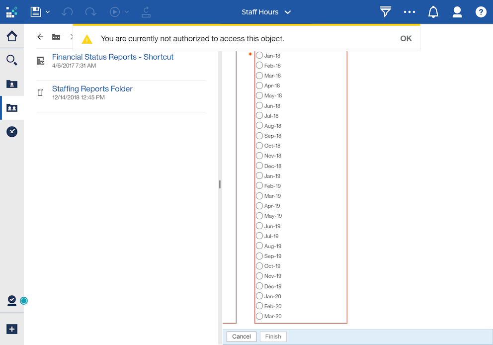
There are many action buttons on the page that users are not authorized to use, yet they are made visible and clickable. These irrelevant options on the screen compete with and diminish the visibility of other important information. When users must explore the website and experiment with the available options, as a user commented, they would expect everything they see on the site is relevant to them. One example is that testers were confused to see an error message read that “You are currently not authorized to access this object” (see Figure 7) when they clicked on some buttons as they explored the system.
On the other hand, critical actions are not obvious. A user explained that when she first used the site, she did not know what to do after the month selection because the critical action button, “Finish,” is small and located at the very bottom of the page—out of visual range (and possibly requiring scrolling).
Recommendation
Customize interface based on user need and authorization level. Simplify the site by eliminating irrelevant options and making the critical selections, such as “Finish,” more prominent.
Issue 4: The date-picking is a “pain.”
There are three select menus to let the user submit a staffing report within a specific period.
The first select menu asks if the inquiry is about the hours in the past or hours in the future. If the user wants to know the actual hours that have been charged in the past, then “Actual” should be selected. If a user is interested in knowing their estimated hours in the future, then “Forecast” should be selected. While the options seem self-explanatory, a user was confused about why such selection is necessary if the past months’ data would show the actual hours charged and future months data would show the budgeted hours regardless of either “Actual” or “Forecast” is selected.
The other two select menus ask the user to specify the beginning and ending months of the staffing report. Users need to select the months of interest from a list of every single month from January 2018 to December 2022 (seen in Figure 9). It is difficult for users to read the options due to small text font and lack of contrast. Small text font and lack of visual cues lead to poor readability. It is especially true for new users not familiar with this format, as the new user who first saw the select menus and complained immediately saying that “It is crazy to look at the options that look almost the same [audible sigh]... it is hard to target what I want.”
The current date picker format is not commonly used and is easy to cause user error. An expert user who participated in the study also commented that she paid extra attention to pick the right month because she “messed up” before and tried to avoid the same error again. The current month picking menu is problematic in several ways.
A user shared in the pre-test interview that she once helped a colleague to troubleshoot an issue of receiving an empty staffing report. The problem turned out to be a result of user error, as they picked an earlier month in the “To” field than the selected month in the “From” field. Users expected that if a wrong month were selected, the system would display an error message and recommend a change in the inquiry without proceeding to the next step. This issue can be easily fixed through disabling unacceptable entries. For example, when January 2019 is selected in the “From” field, any other earlier months become disabled in the “To” field. It is also a good practice that when a user error occurs, the system should help users to recognize, diagnose, and recover from the error by suggesting a solution6. In our case, the system should not run the report if it detects problematic entries, and the system should highlight the problematic fields and suggest modifying the month range.
Recommendation
- Eliminate the select menu for “Actual” and “Forecast” as it does not affect the report.
- Redesign the date picker using a more familiar format.
- Include practical constraints to limit users’ choices, provide immediate feedback when an error is detected, present users with a confirmation option before committing to the action, and suggest ways for the user to recover from an error. When selecting the month, if it is not possible to include constraints in Cognos, users should be reminded and become aware of the limitation.
Issue 5: Bad defaults
All testers did not like the current default months. The first month in the “From” field is January 2017 and the first month in the “To” field is also January 2017. Users remarked they rarely need to see what their coverage was two years back; they must scroll down in the list to make the correct selection. A user said that “I already know I don't need to go here” while pointing at months in 2017, “because I've messed up before” and then she scrolled down to January 2018 to continue Task 1. Another user suggested a better default is to have the current month in the “From” field and the third month after in the “To” field because this is how she usually specifies the month range when requesting a staffing report.
Recommendation
Utilize the existing user data to prioritize the options and set the most popular choices as the default selections. For example, verify if the current month is the most frequently selected in the “From” field and identify how many months earlier or later users commonly specify in the “To” field.
Issue 6: System version inconsistencies
Users reported that the current Cognos interface is different from the previous version. As a user stated, “It changed enough that [I] need to stop and figure it out.” Another user commented that “It took me a while to learn.” When users had to use the new system for a familiar task (for instance, Task 2, clearing the current staffing report to run a new one), and the solution was not obvious on the interface (in this case, no button indicating the action of clearing data or returning to the previous page is visible), the expert users heavily relied on their knowledge of prior system version (that is, looking for a button at the upper right corner of the page where the “back” button used to be in the last version). Failure to leverage a user’s knowledge of prior systems requires users to learn the new UI, distracts them from completing the central task, and undermine users’ confidence in using the system. In contrast, when consistency is present among different versions, users can easily transfer knowledge from the previous version to the new one, focus on executing the task, and enjoy a more satisfying experience.
Recommendation
Ensure consistency among versions if possible. User onboarding can be a powerful tool for both expert and new users. If users do not know the system, provide user onboarding focused on how to use the system. For expert users, providing onboarding which concentrates on showing the new features or explain the new changes to facilitate a smoother transition.
Limitations
The major limitation of this study is its relatively small sample size, which only consists of two expert users and a new user. The expert users included in the study are junior to mid-level staff in the organization. Thus, the results represent only a tiny fraction of young staff (two of 1,800) of overall company population. This study is a voluntary independent project that was carried out after normal business hours. We had to work with limited resources such as access to testers after working hours and incentives for participation. The qualitative data analysis is labor intensive; thus, we intentionally recruited a small number of testers to ensure we could learn the most out of them.
The mixed-method research design compensates the small sample size limitation to some extent. The usability patterns we discovered from the data using different research methods are consistent among testers. The mixed methods increase the validity of these research findings and enhance the credibility of this study.
Also, as stated in the analytic section, the purpose of the study is to discover the existing problems and start a dialog of implementing the best design practices for the client organization’s internal tools. We did not know what the limitations the IT department had to work with while developing the Staff Hours application using the Cognos platform. The suggestions offered in this report may be difficult or unrealistic to implement. Therefore, further research is needed to understand what the current system constraints are before redesigning the Cognos 11 Staff Hours application. In parallel, it may be of interest to the client organization to evaluate the appropriateness of using Cognos 11 for staff time tracking, and or if there is a more cost-effective tool available in the market that better suit the client organization’s needs.
Conclusion
Cognos is an important internal tool for client organization staff to plan and monitor their staffing hours. A thoughtful user interface design of such an important tool not only provides a satisfying user experience to staff but also can reduce training and support cost and increase staff productivity. The evaluation of the upgraded Cognos 11 suggests several areas for interface design improvements. Some outstanding issues include the system’s overly complicated IA, unfriendly report layout, and other usability barriers preventing efficient use of the system. The recommendations embedded in this report are designed to address the issues discovered. We hope that this report not only serves as a UI guide for the next Cognos Staff Hours application development but also could start a dialogue for the company leadership to become aware of the staff’s experience with internal tools.
Introduction (2 Minutes)
Hi, my name is [researcher name], and I’m here to understand better how you use Cognos reporting system. This interview and the test will take about 1 hour, during which time we’ll go through some questions, I will also ask you to use the system to perform some small tasks and there will be a small questionnaire for you to fill out at the end of the session. Throughout, I’d like you to treat me as if you’re describing the situation to someone who isn’t familiar with the system. I’m here to learn from you.
To the extent possible, I will take your comments to be confidential. I will aggregate all the comments from several interviews I am conducting so that your comments are not easily traced to you. If I quote you in my final report, I will do so without identifying your name or specific role. If there’s anything you really don’t want on the record, even if it’s anonymized, please let me know that, too. Also, this interview is entirely voluntary on your part – if for any reason you want to stop, please let me know. We can end the interview at that point with no repercussions for you of any kind. I can also throw out anything you’ve told me until that point.
Do you have any questions for me?
Do you mind if I take an audio recording? This is just so that I don’t miss anything – no one other than the research team will have access to the recording. Thanks.
Pre-test Interview (10 Minutes)
In general, are you happy with the Cognos reporting system?
How often do you use the system?
When was the last time you used the system?
How familiar were you with the system? How long have you been using the system?
What are the main tasks you use the system for? (follow up: Out of 100%, what percent would each task you just described take up?)
I’d like you to think back to the most recent time when you used the system. Can you tell me a bit about that event?
Prompts:
- When did the event take place?
- Where were you? Office, at home? Was anyone around you?
- What was your goal using the system? What’s the trigger event?
- Roughly how long did it take for you to complete your task?
- How did you use the system? (what the steps were involved)
- Did you encounter any problems? If yes, what did you do?
- Did anything unexpected happen?
- Were you able to accomplish your task with the system?
- What did you do after using the system?
- Would you say it was a typical event? If not, what was unusual about it?
Now, I’d like you to think about one of your interactions with the system that was frustrating for you. For example, you were in a rush, and you need to complete a task quickly, but the system failed.
Usability Test (15 Minutes)
In the next 15 minutes, I would like to observe you using the system to complete 3 simple tasks. I would like you to constantly explain to me what you are thinking and doing. I would like to get your permission to take a video recording of your screen so that I capture everything.
Please keep in mind that you are not being tested, it is the system being tested. The task will allow me to see how well the it is designed to help users complete the tasks they need to complete. Please tell me when you think you’ve completed the task or if you decide to give up the task and are ready to move to the next task. I won’t offer any help when you perform the task. My goal is to see how you will approach the task without help.
- Task 1: Review the actual hours you've charged to the projects from January 2018 to December 2018;
- Task 2: Clear Task 1's result and prepare to run another report;
- Task 3: Check how you are staffed in the first half of 2019 and prepare a report to send to your staff manager to discuss your coverage;
- Task 4: Identify the months in 2019 in which projects are not sufficiently covered.
Prompts:
- What are you doing? What are you looking for?
- What are you reading? Can you read out loud?
- What hypothesis do you have about how system work?
- How do you interpret system options?
- How do you interpret system feedback?
- Explain your decision
- How are you feeling?
- What are you thinking when you do that?
Note taking:
- Pauses
- Missteps/multiple attempts
- Intentional detours
Post-test Interview (10 Minutes)
Note for the researcher: ask to follow up questions about the incidents where a user got stuck or made an error during the testing.
In general, are you happy with the current version Cognos reporting system?
What do you like and dislike?
What are the things you would like to be improved in the system during a redesign?
What are the features you would like to see added in the system during a redesign?
Is there anything you think I ought to know about your experience today?


